Sweet to My Soul
Brand Identity & Packaging Design
This brand identity was designed for a Miami-based home bakery expanding into a local storefront. Warm neutrals and hand-drawn accents convey homemade comfort, while flexible logo marks and packaging concepts support growth across desserts, pastries, and the bakery’s signature tres leches.


Concept & Research
The goal was to give the brand a playful, inviting visual identity that would attract dessert-lovers while still reflecting the owner's understated personal style. I began by interviewing the owner about her goals and aesthetic preferences and surveying potential customers on what draws them to a bakery. Questions included “Why do you buy desserts?” and “What first catches your eye when choosing a shop?”
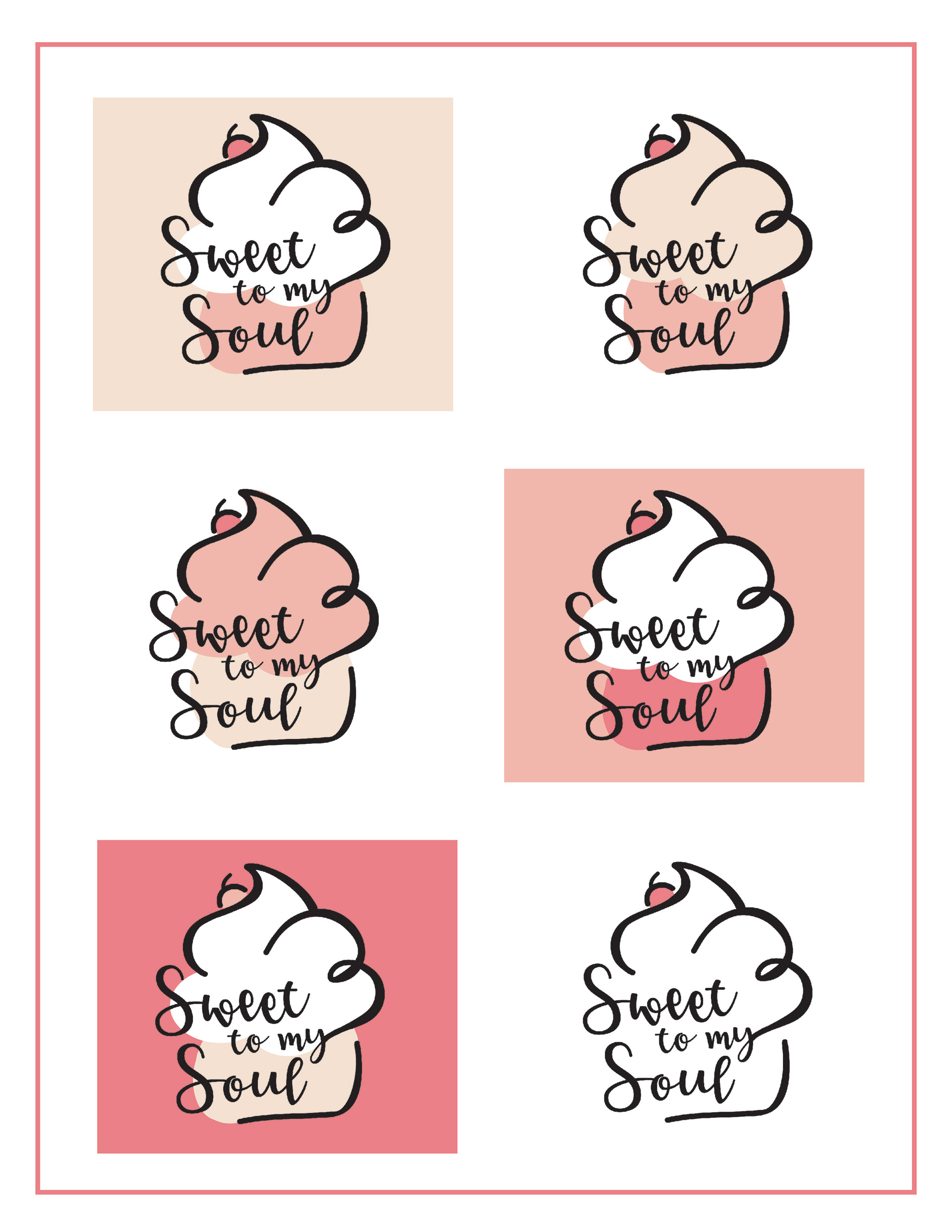
Early on, I linked the word soul with heart imagery. That insight shaped the final logo: the “y” in my sweeps upward to form an open-ended heart, which doubles as the bottom layer of frosting on a stylized cupcake. This single mark combines sweetness, warmth, and a clear cue that it’s a bakery.
Design & Process
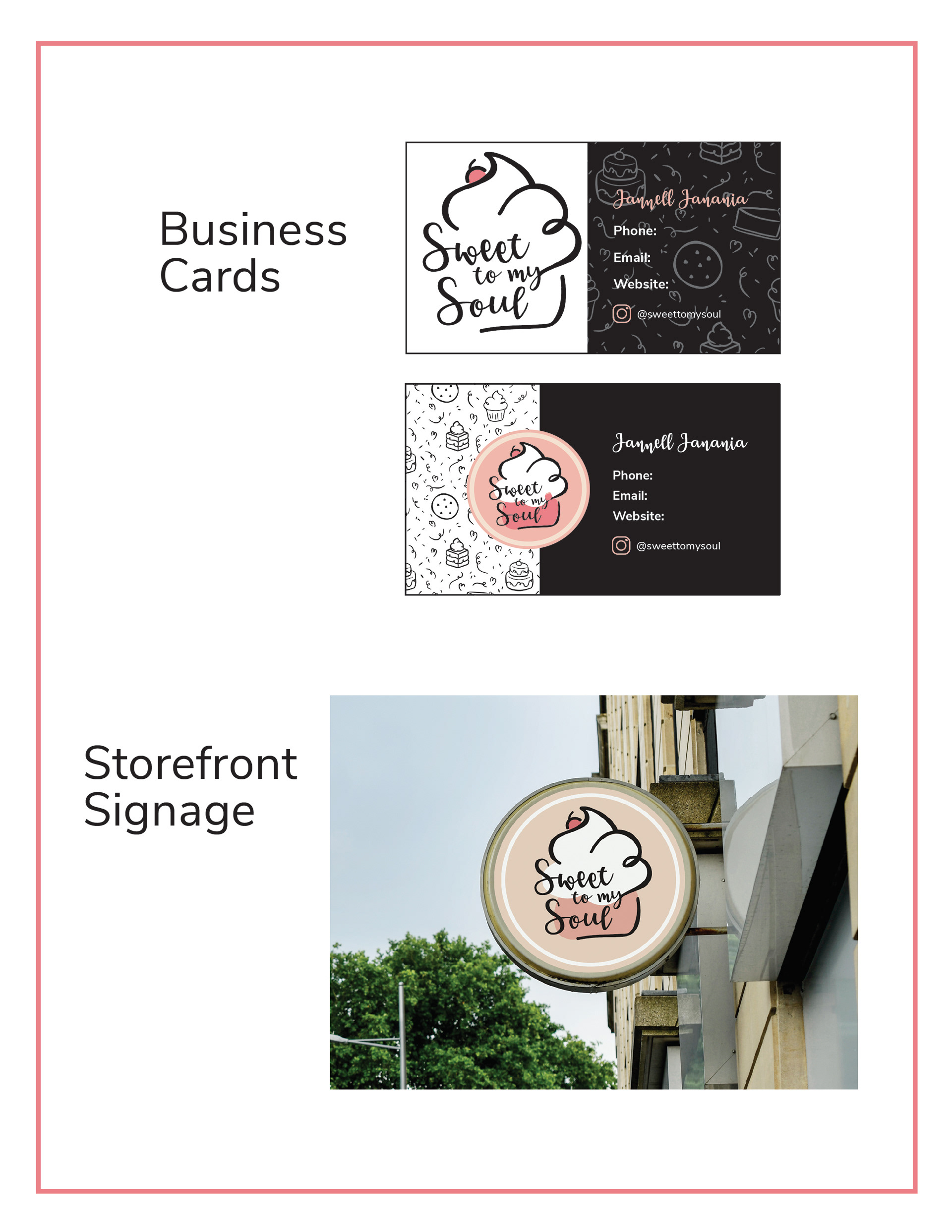
I balanced my cousin’s minimalist preferences with the warmth people expect from a bakery. The palette mixes white, black, various pinks, and a soft beige, pairing her love of simple neutrals with a friendly pop of color. A looping script typeface reinforces the heart motif while keeping the mark approachable and celebratory. After finalizing the logo, I extended the identity into packaging and merchandise mock-ups, applying a repeating frosting pattern drawn in Procreate to items like dessert boxes and business cards. All logo and brand-manual elements were built in Adobe Illustrator, with product mock-ups created in Photoshop.
Tools: Adobe Illustrator, Adobe Photoshop, Procreate

Sweet to my Soul Pattern
Outcome & Reflection
While the owner appreciated the playful direction, she ultimately preferred keeping her original minimalist logo, which serves as a reminder that successful branding must align with a client’s personal vision as much as audience appeal. Interestingly, friends and family members, favored my redesign for its energy and polish.
This project deepened my understanding of brand-identity development: interviewing a client, researching a target audience, and translating strategy into cohesive visuals. I discovered that, although I enjoy crafting collateral and packaging, I’m more inspired by applying or evolving an existing brand than by starting a logo from scratch. Even so, exploring the full branding process gave me valuable insight into how design and marketing meet when a small business is ready to grow.