National Geographic Website Redesign
Conceptual Homepage UI/UX
A digital concept re-imagining National Geographic’s homepage. Bold asymmetry, layered photography, and clean typography elevate the brand’s renowned storytelling, creating a contemporary, visually dynamic browsing experience for modern explorers.

Concept & Research
A class assignment challenged me to reimagine a well-known homepage using asymmetry as the guiding principle. I chose National Geographic, a site I admire for its rich journalism and striking photography. While their existing homepage is clean and informative, it can feel dense, prioritizing text over the breathtaking images that define the brand. My goal was to create a fresh, dynamic layout that still foregrounds articles but invites users in through stronger visual storytelling.
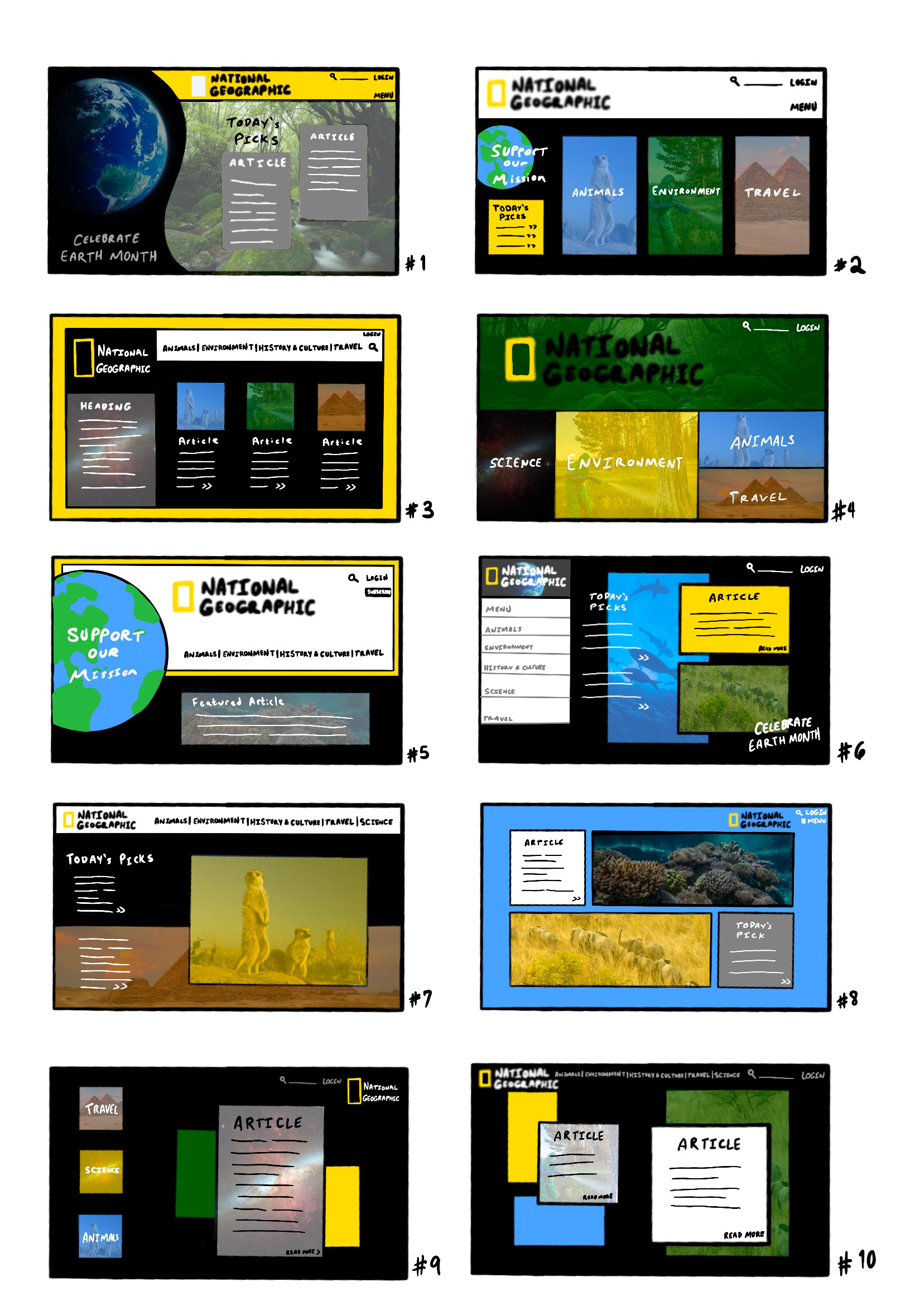
Early concept sketches of website layouts
Design & Process
I retained the brand’s iconic black, white, and yellow palette to keep the redesign recognizable and contemporary. Starting with ten thumbnail sketches in Procreate, I explored multiple asymmetric compositions before combining favorite elements into the final design. In Photoshop, I built a homepage featuring two highlighted feature articles framed by geometric shapes for depth and emphasis, a black wave along the left edge that breaks the grid and subtly guides the eye and carries the attention of the logo and brand, and a flexible background photograph that's set to low opacity, so National Geographic’s own stunning images can rotate without competing with text and featured content.
Tools: Adobe Photoshop, Procreate
Outcome & Reflection
The redesign was praised in critique for its balance of positive and negative space, and it was one of the few projects that required no revisions. I still consider this one of my strongest early layouts, proving how asymmetric structure can remain functional and elegant. Looking back, I’d refine the typography and expand the project into a modern UX/UI prototype, considering mobile responsiveness and interactive elements, but the exercise cemented my appreciation for thoughtful web layout and visual hierarchy.